Modernizing Keycloak - Building Custom Themes with React, Tailwind v4, and Shadcn UI
If you have ever worked with Keycloak, you know that it is an incredibly powerful Identity and Access Management solution. However, you likely also know the pain of trying to customize its default look and feel.
Traditionally, theming Keycloak meant wrestling with FreeMarker templates, writing raw CSS, and rebuilding JAR files just to see a color change. It was a slow, developer-hostile process.
Enter Keycloakify and the Keycloakify Shadcn Starter — now available as an npm package for instant setup.
In this post, I want to share a modern, production-ready starter kit I built to make Keycloak customization not just bearable, but actually enjoyable. The best part? You can now install it directly from npm and have a fully functional theme running in minutes.
📦 npm package: @oussemasahbeni/keycloakify-login-shadcn
The Tech Stack
This project allows you to build Keycloak themes using the modern frontend stack you already know and love:
- React (Type-Safe)
- Vite (for lightning-fast HMR)
- Tailwind CSS v4 (Utility-first styling)
- shadcn/ui (Accessible, copy-paste components)
- Keycloakify v11 (The bridge between React and Keycloak)
Why use this starter?
While Keycloakify does the heavy lifting of compiling React to Keycloak themes, setting up a production-ready project still takes time. This starter comes pre-configured with everything you need for a professional identity provider, and now it's available as an npm package for instant setup.
Key Features
Modern UI - Beautiful, responsive design using Tailwind CSS v4 and shadcn/ui components that look great out of the box.
Dark Mode - Built-in dark/light/system theme toggle with persistent preferences across sessions.
Multi-language Support - i18n ready with English, French, and Arabic (RTL supported) translations. Adding a new language is as simple as adding a key to the configuration:
// src/login/i18n.ts
.withCustomTranslations({
    en: {
        welcomeMessage: "Welcome to Your App",
        loginAccountTitle: "Login to your account",
    },
    fr: {
        welcomeMessage: "Bienvenue sur votre application",
        loginAccountTitle: "Connectez-vous à votre compte",
    },
    ar: { /* Arabic translations with RTL support */ }
})
Custom Email Templates - One of the most neglected parts of IAM is email. This project integrates jsx-email, allowing you to build transactional emails (Password Reset, Email Verification, Login Errors) using React components. Preview them locally before deploying:
pnpm emails:previewComplete Login Flow - All 35+ Keycloak login pages are fully customized, including Login, Register, OTP, WebAuthn (Passkeys), Terms & Conditions, Update Profile, and more.
social Login Providers - Pre-styled icons for 16+ OAuth providers including Google, GitHub, Microsoft, and more.
Storybook Integration - Visual testing and documentation for all components to streamline development.
Vite Powered - Lightning-fast development with HMR and optimized production builds.
Type-Safe - Full TypeScript support throughout the codebase for better developer experience.
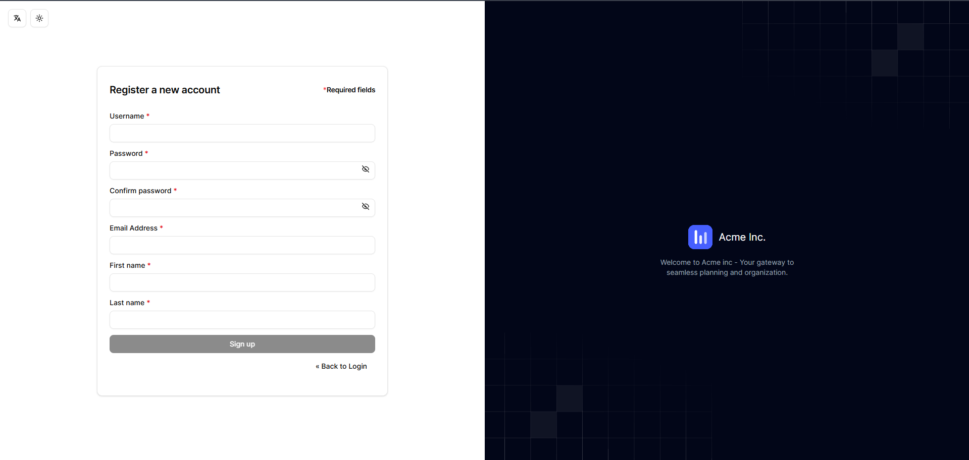
Screenshots
Here is a preview of the custom login screen:

Developer Experience (DX)
The biggest advantage of this setup is the development loop. You can run the theme locally and see changes instantly without running a heavy Keycloak Docker container during UI development.
# Start development server with hot reload
pnpm dev

# Run Storybook for component isolation and testing
pnpm storybook

# Preview email templates locally
pnpm emails:preview

# Build the Keycloak theme JAR
pnpm build-keycloak-theme
How to use it
There are two ways to get started: using the npm package (recommended) or cloning the repository for deeper customization.
Quick Start with npm Package
The fastest way to get started is using the published npm package:
Create a new Vite + React + TypeScript project:
pnpm create vite
# Choose React and TypeScript when prompted
cd your-project-name
Install the theme package:
pnpm add keycloakify @oussemasahbeni/keycloakify-login-shadcn
pnpm install
Initialize Keycloakify:
npx keycloakify init
# Select login theme and install stories when prompted
Configure Vite (update
vite.config.ts):import react from "@vitejs/plugin-react"; import { keycloakify } from "keycloakify/vite-plugin"; import { defineConfig } from "vite"; import path from "node:path"; import tailwindcss from "@tailwindcss/vite"; export default defineConfig({ plugins: [react(), tailwindcss(), keycloakify({ accountThemeImplementation: "none" })], resolve: { alias: { "@": path.resolve(__dirname, "./src") }, }, });Build the theme:
pnpm build-keycloak-themeThis generates a standard
.jarfile that you can deploy to any Keycloak instance.
Clone for Deep Customization
If you want full control and plan to customize extensively:
git clone https://github.com/Oussemasahbeni/keycloakify-shadcn-starter.git
cd keycloakify-shadcn-starter
pnpm install
Then customize your logo in src/login/assets, adjust colors in src/login/index.css, and modify components as needed.
Conclusion
Identity screens are the front door to your application. They shouldn't look like they were built in 2010. By leveraging React and Keycloakify, we can bring the full power of the modern frontend ecosystem to Keycloak.
With the npm package now available, getting started has never been easier. Install it, customize it, and deploy professional-looking authentication screens in minutes.
Check out the repository, give it a star, and feel free to contribute!